Skip to main content
Taming the WPF Expander Control
How to Enable Using the Binding Builder in WPF and Silverlight Applications
When the Data Sources Window is used to generate the UI, the generated XAML injects design-time information so that the Binding Builder can be used to create bindings for the UI controls.
What if your application was written in Visual Studio 2005 or 2008; or you used the XAML Editor, the Designer or Expression Blend without the Data Sources Window and you now want to take advantage of the new Binding Builder?
What if your coding style is to assign the DataContext for your forms in code and not data bind to CollectionViewSources in your XAML?
This very short walk-though will demonstrate the simple requirements to enable you to use the new Binding Builder in a variety of scenarios like the ones mentioned above.
Requirements
This walk-through assumes you have the opened the attached solution. The attached zip file contains both a VB.NET and C# version of the solution.
Table of Contents
- Why use the Binding Builder?
- What is the Problem we Trying to Solve?
- Design-Time Properties
- Let's Implement the Solution
- Binding Builder in XAML View
- Links
- Comments
Why use the Binding Builder?
The Binding Builder makes it easier to set up bindings and more importantly makes it easier to create accurate bindings so that you don't need to debug so often. This alone will save you time, limit frustration and increase your productivity.
If you add to this all the other improvements in the WPF and Silverlight Designer like the image picker, the resource picker, the brush editor, etc. I believe that we have a much-improved experience for WPF and Silverlight developers in Visual Studio 2010.
What is the Problem we Trying to Solve?
Let's first run the application to get a feel for how it works at run-time. After starting the application change the selected Customer using the ComboBox at the top. Resize the application; notice how the DataGrid allows data editing.
This application was hand coded using the XAML Editor and the DataContext is set in the Loaded event of the Window. As a result, the tooling has no way to determine the DataContext at design-time; additionally, the Binding Builder will have no way to list properties in its Path section.
A picture is worth a thousand words so…
Open MainWindow.xaml in the Designer
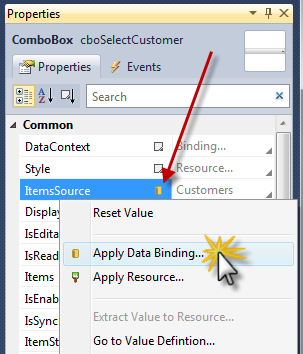
Select the ComboBox to the right of the Select Customer TextBlock
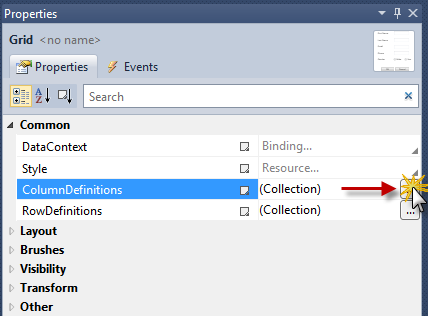
Using the Properties Window:
- Click on the ItemsSource property Property Marker pointed to by the red arrow
- Select Apply Data Binding… from the Context Menu
- Optionally, you can also click the gray text to the right of the Property Marker to open the Binding Builder
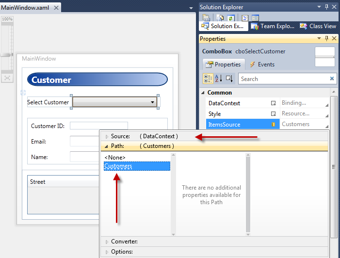
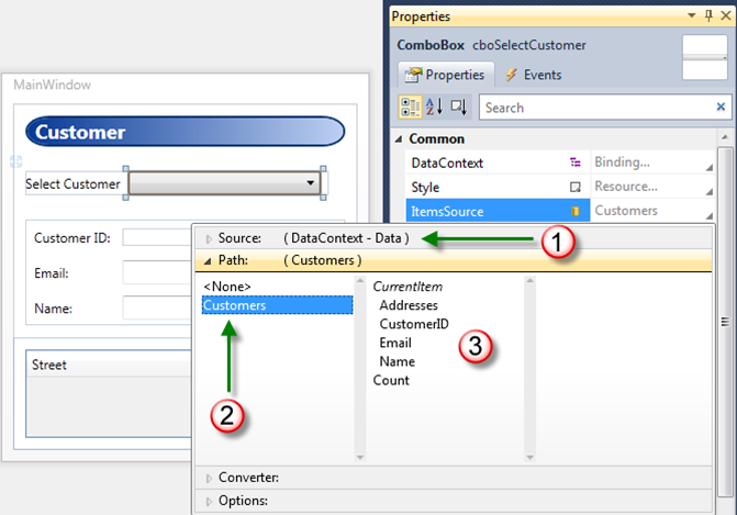
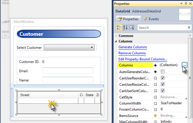
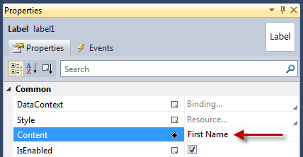
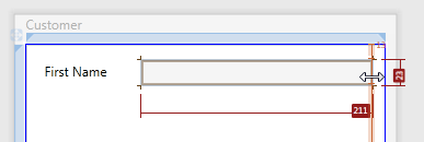
In the below image we have two problem indicators
- First, the DataContext is null. This is indicated by the text pointed to by the top red arrow; it does not display class type name that is assigned to the DataContext or what class type name the DataContext is inheriting from.
- Second, since the DataContext is null, the Path Customers pointed to by the bottom red arrow; cannot be resolved by the Binding Builder which is indicated by the dash line under the Path property name.
Let's look at one more example.
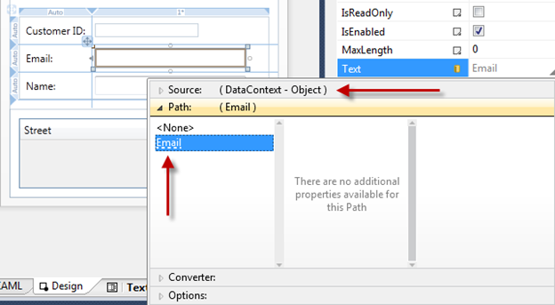
- Select the TextBox to the right of the Email Label
- Using the Properties Window open the Binding Builder for the Text property
- First, the DataContext is bound to Object. Object does not have properties we can use to set the binding paths.
- In this case, the TextBox is inheriting DataContext from the parent Grid control
- The parent Grid control has its DataContent bound to the SelectedItem of the ComboBox, which is why the Email TextBox has its DataContext set to Object.
- Second, the Email TextBox Text property path is set to Email but like the previous example, it has a dashed underline indicating the Binding Builder was unable to resolve the Email property path.
Design-Time Properties
The problem we need to solve is how to provide "a shape" to the Binding Builder at design-time. When I say "shape" I mean an instantiated Type that the Building Builder can reflect over and then list those properties in the Path selection tab to establish the binding.
In this walk-through we will use the d:DataContext property and d:DesignInstance MarkupExtension.
The "d:" in above property and Markup Extension is the alias to the design namespace where the all the design properties are members of. Here are links to MSDN topics that cover all the "d:" properties and Markup Extensions.
The "d:" properties and Markup Extensions cannot be created in user code or extended in user code; they can only be used in XAML.
The "d:" properties and Markup Extensions are not compiled into your application; they are only used by the Visual Studio WPF and Silverlight Designer and Expression Blend tooling.
d:DataContext Property
d:DataContext, specifies a design-time data context for a control and its children. When specifying d:DataContext, you should always provide the same "shape" to the design-time DataContext as the run-time DataContext.
If both a DataContext and d:DataContext are specified for a control, the tooling will use the d:DataContext.
d:DesignInstance Markup Extension
If MarkupExtensions are new to you, please read this MSDN topic Markup Extensions and WPF XAML.
d:DesignInstance, returns the an instantiated Type ("shape") that you want to assign as the data source for binding to controls in the designer. The type does not need to be creatable to be used for establishing "shape."
d:DesignInstance MarkupExtension Properties

| Type | Name of the Type that will be created. Type is the default parameter in the constructor. |

| IsDesignTimeCreatable | Defaults to False. Is the specified type creatable? When false, a faux type will be created instead of the "real" type. |

| CreateList | Defaults to False. When true, will return generic list of the specified type. |
Visual Studio Markup Extension IntelliSense
The XAML Editor in Visual Studio 2010 provides IntelliSense when editing Markup Extensions, making the entry of design-time properties and Markup Extensions easy.
Let's Implement the Solution
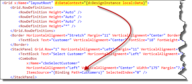
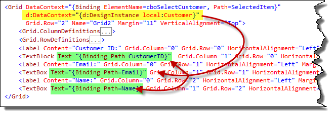
In this application's Loaded event, I assign the Data class to the Window's DataContext property. To follow this same pattern, we need to assign the Data class to a design-time DataContext or d:DataContext to either the Window or top level Grid control in the XAML file. By doing this, we are allowing the d:DataContext to be inherited down the tree of elements, just like it does when the application is at run-time.
The below red arrow indicates DataContext inheritance for the Grid control's child controls. Notice how the ComboBox ItemsSource property is bound to the Customers property on the inherited DataContext, which is the Data class.
Top ComboBox
- Change MainWindow.xaml into XAML View
- Locate the root Grid named "layoutRoot" add the following XAML as pictured below:
d:DataContext="{d:DesignInstance local:Data}"
Change MainWindow.xaml back to Design View
Select the ComboBox
Using the Properties Window, open the Binding Builder for the ItemsSource property:
- First, the DataContext now has a "shape," the Data class
- Second, the Customers Path property name is no longer has a dashed underline because, the Building Builder can resolve the property name on the DataContext
- Third, since Data.Customers is a collection, the individual properties of the Customer class are now listed in the Path section as part of the Current Item. These properties would be used if we were editing a DataTemplate for the ComboBox.
The below red arrow indicates d:DataContext inheritance for the child controls of the Grid; this enables property resolution for the Binding Builder tool.
- Change MainWindow.xaml into XAML View
- Locate the middle Grid that has its DataContext bound as pictured below and then add the following XAML as pictured below:
d:DataContext="{d:DesignInstance local:Customer}"
Change MainWindow.xaml back to Design View
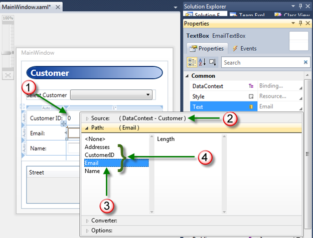
Select the Email TextBox
Using the Properties Window, open the Binding Builder for the Text property:
- First, the Customer ID TextBlock now displays a 0. This is because the design-time DataContext is now a real instance of the Customer class. The CustomerID property is an Int32 that has a value of 0
- Secord, the DataContext now has a "shape," the Customer class
- Third, the Email Path property name is no longer has a dashed underline because, the Building Builder can resolve the property name on the DataContext
- Fourth, all of the properties exposed by Customer type are available for selection in the Path section of the Binding Builder
DataGrid
At run-time, the Grid's DataContext is a collection of Addresses that comes from the Addresses collection property on the selected Customer class.
Now we need to provide the same "shape" to the design-time DataContext of the Grid.
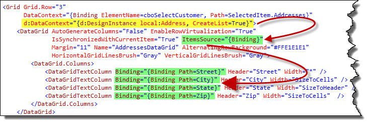
The below top red arrow indicates d:DataContext inheritance for the child controls of the Grid; the ItemsSource for the DataGrid is a collection of Addresses at both design-time and run-time.
The individual rows in the DataGrid will each be bound to an instance of the Customer class. The bottom red arrow indicates the relationship between the ItemsSource property and the individual properties that are bound to each DataGridRow.
- Change MainWindow.xaml into XAML View
- In the next step, we will use the d:DesignInstance Markup Extension to create a list of Address instances for the design-time DataContext
- Locate the Grid control at the bottom of the file. Add the following XAML as pictured below:
d:DataContext="{d:DesignInstance local:Address, CreateList=True}"
- Change MainWindow.xaml back to Design View
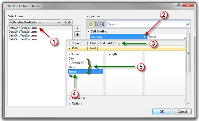
- Select the DataGrid by clicking it like the below image on the left
- Using the Properties Window, open the Columns property Collection Editor by clicking the ellipsis button as in the below image
First, select the first DataGridTextColumn
Second, click the Binding property Property Marker, select Apply Data Binding… from the Context Menu:
- Third, the DataContext "shape" is the Address class
- Fourth, Street is not underlined with dashes
- Fifth, all of the properties exposed by Address type are available for selection in the Path section of the Binding Builder
Binding Builder in XAML View
Developers working in the XAML Editor will be surprised to know that the Properties Window and its features like selection sync with the XAML Editor, Binding Builder, Resource Picker and Image Picker continue to work even if the Designer is not visible.
In order to utilize the Properties Window in the XAML Editor, the Designer must load, not necessarily be visible.
If you open a XAML View and the Properties Window does not load, momentarily switch to Design View then back to XAML View by clicking these two tabs pictured below.
Notice the Grid is selected in XAML View and is displayed in the Tag Navigator.
Links
MSDN topic Data Binding Overview (must read for all WPF and Silverlight developers)
MSDN topic Walkthrough: Using a DesignInstance to Bind to Data in the WPF Designer
MSDN topic Design-Time Attributes in the WPF Designer
MSDN topic Design-Time Attributes in the Silverlight Designer
MSDN topic Walkthrough: Using a DesignInstance to Bind to Data in the Silverlight Designer
MSDN topic Markup Extensions and WPF XAML
Microsoft values your opinion about our products and documentation. In addition to your general feedback it is very helpful to understand:
- How the above features enable your workflow
- What is missing from the above features that would be helpful to you
Thank you for your feedback and have a great day,
Karl Shifflett
Expression Team
EnablingTheBindingBuilder.zip
How to Insert a Row in a Data Entry Form
This article has a corresponding video that can be viewed here.
A common task after a form is developed is inserting a new row in the form. This short walk-through will show you how to insert a new row in an existing data entry form.
For this exercise our requirement is to insert a Label and TextBox for the middle initial. This row needs to be inserted between the first and last name rows.
Inserting a row is easy. Remember that when you create a row using the Grid designer, you are in effect splitting a row.
Table of Contents
- Steps
- Step One – Verify the Grid Can Grow
- Step Two – Set Target Row to be Split to Fixed Size
- Step Three – Increase Target Row Size
- Step Four - Add New Row by Splitting the Target Row
- Step Five – Set Split Row Sizes
- Step Six – Add New Controls, Set Control Sizing, Auto Size Row
- Comments
- Video
Steps
- Verify the grid can grow, if not provide additional space for the new row
- Set the target row to be split to Fixed sizing
- Increase target row size
- Add new row by splitting the target row
- Set split row sizing
- Add new controls, set control sizing, set row sizing
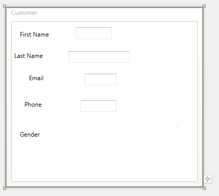
Before and After Inserting a New Row

Figure 1 Before and After
Step One – Verify the Grid Can Grow
- Check to see if the Grid can grow.
- If the Grid has a Star size row this takes care of this requirement.
- If not resize the container that the Grid is a child of to allow the Grid to grow in height.
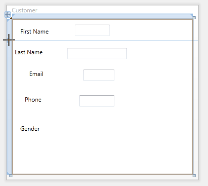
Step Two – Set Target Row to be Split to Fixed Size

Figure 2 Setting Target Row to Fixed Size
- Using the Grid row size selector, set the row you need to split to Fixed size.
Step Three – Increase Target Row Size

Figure 3 Increase Target Row Size
- In the XAML editor or Properties Window, set the row height you are splitting to a higher value. For this example the row was resized to 60.
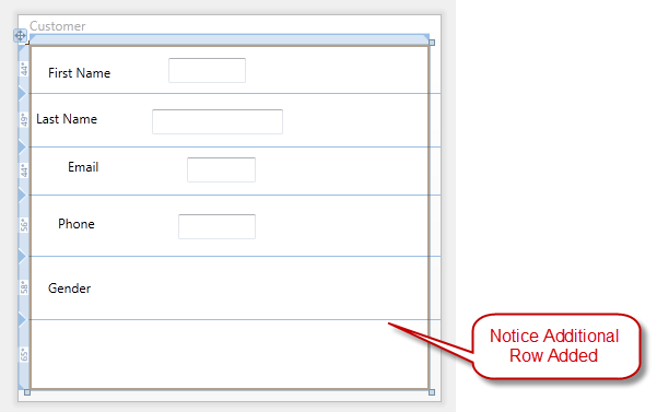
Step Four - Add New Row by Splitting the Target Row

Figure 4 Add New Row by Splitting the Target Row
- Click on the Grid rail to add a new row.
- If you click above or below the existing controls you won't cause those controls to span across two rows.
- If you add the row and the Grid line is touching the existing controls, those controls will be spanned across two rows. In this case after you have inserted the new row, you'll need to also remove the Grid.RowSpan attached property from those controls.
- In Figure 4 above the new row was added above the existing controls in the row.
- When the new row is inserted, controls in higher numbered rows have their Grid.Row attached property automatically incremented.
Step Five – Set Split Row Sizes

Figure 5 Inserting Row Step Three
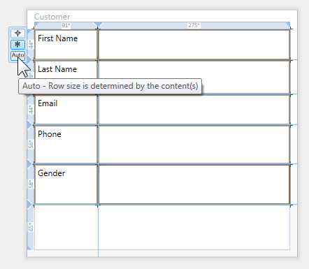
- Use the Grid row size selector and set the last name row to Auto size.
- Use the XAML editor or Properties Window and set the new row's Fixed size to 35.
Step Six – Add New Controls, Set Control Sizing, Auto Size Row

Figure 6 Add New Controls, Set Control Sizing, Auto Size Row
- Drag a Label to the first column, second row.
- Using the designer, resize the Label so that it fits in the first column.
- Using the Properties Window set the following properties on the new Label:
- Height to Auto
- Width to Auto
- VerticalAlignment to Center
- HorizontalAlignment to Stretch
- Margin to 3.5
- Content to Middle Initial
- Drag a TextBox to the second column, second row.
- Using the Properties Window set the following properties on the new TextBox:
- Height to Auto
- Width to 25
- VerticalAlignment to Center
- HorizontalAlignment to Left or Stretch. If using fixed width use Left or if using Auto width use Stretch.
- Margin to 3.5
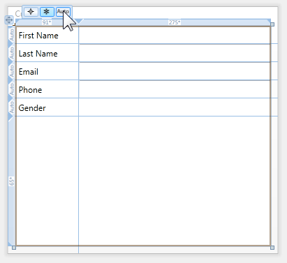
- Using the Grid row size selector, set the new row to Auto size.
You have just quickly inserted a new row in your data entry form.
Microsoft values your opinion about our products and documentation. In addition to your general feedback it is very helpful to understand:
- How the above features enable your workflow
- What is missing from the above feature that would be helpful to you
Thank you for your feedback and have a great day,
Karl Shifflett
Visual Studio Cider Team
How to Layout a Data Entry Form
This article has a corresponding video that can be viewed here.
The WPF & Silverlight Designer provides the ability to quickly layout a data entry form. This walk-through will provide a workflow for laying out Labels and TextBoxes using the Grid control as the layout panel.
Table of Contents
- Completed Form UserControl
- Step One – Add Rows and Columns and Controls
- Step Two – Auto Size Label Controls
- Step Three – Auto Size TextBox Controls
- Step Four – Auto Size Rows
- Step Five – Size Columns
- Video
- Comments

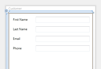
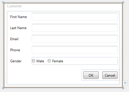
Figure 1 Completed Form
Step One – Add Rows and Columns and Controls

Figure 2 Data Entry Form Step One
- Add a new UserControl to your project.
- Select the root Grid by clicking inside the UserControl.
- Add a column by clicking on the upper Grid rail in the desired location.
- Add three rows by clicking on the Grid rail in the desired location.
- Drop the required Label controls in the first column.
- Drop the required TextBoxes or other controls in the second column.
| Tip |
Notice that the column width is 137. The default width of a Label control when added from the ToolBox is 120. Making the target column wider than the Label makes it easy to initially drop the Label control on the design surface. The row heights are also unimportant at this stage. Creating the rows taller than the Label or TextBox control makes it easy to create the controls. |
Step Two – Auto Size Label Controls

Figure 3 Data Entry Form Step Two
- Multi-select the Label controls by CTRL+clicking each control on the design surface or use the Document Outline.
- Using the Properties Window set the following properties:
- Height to Auto
- Width to Auto
- VerticalAlignment to Center
- HorizontalAlignment to Stretch
- Margin to 3.5
Step Three – Auto Size TextBox Controls

Figure 4 Data Entry Form Step Three
- Multi-select the TextBox controls by CTRL+clicking each control or use the Document Outline.
- Using the Properties Window set the following properties:
- Height to Auto
- Width to desired fixed value or Auto
- VerticalAlignment to Center
- HorizontalAlignment to Left or Stretch. If using fixed width use Left or if using Auto width use Stretch.
- Margin to 3.5
Step Four – Auto Size Rows

Figure 5 Resizing Grid Rows
- Resize the rows with Labels to Auto.
- Hover the mouse over the left grid rail.
- The Grid Row size selector will appear.
- Click on Auto.
- Repeat for each row.

Figure 6 Data Entry Form Step Four
Figure 6 above shows the form with each row with controls set to Auto size.
Step Five – Size Columns

Figure 7 Data Entry Form Step Five
- Assign the Content property to each Label control.
- Set column one of the Grid to fixed size of 100.
- If you need to localize your application you can leave the Label column set to Auto size. Then when the Label text grows wider when a different language is used at runtime the Label column will automatically grow in size.
- If space is a consideration, the TextBlock control provides text wrapping. Using the same technique also set the MaxWidth property on the column. This will ensure that the column is never wider than this value. If the TextBlock text is wider than the MaxWidth it will wrap its text. Since the rows are Auto sized, when the text wraps that row's height will be increased to accommodate the wrapped text.
- Set column two of the Grid to Star size.
| Note |
The Grid row and column size selector does not allow changing of the numeric values for Fixed or Star sizes. Instead use the Properties Window or XAML editor. |
Microsoft values you opinion about our products and documentation. In addition to your general feedback it is very helpful to understand:
- How the above features enable your workflow
- What is missing from the above feature that would be helpful to you
Thank you for your feedback and have a great day,
Karl Shifflett
Visual Studio Cider Team
Known Issue: Attached Property ListBox.AlternationIndex Causes Error in Designer
Known Issue
When writing ListBoxItem triggers in a style that trigger on the ListBox.AlternationIndex attached property value, if you use the valid syntax ListBox.AlternationIndex like the first trigger below, the designer will display the following error:
Error Property 'AlternationIndex' was not found in type 'ListBox'…
Workaround
The workaround is to use the alternate valid syntax ItemsControl.AlternationIndex as the second trigger below does.
<Style x:Key="alternatingWithTriggers" TargetType="{x:Type ListBoxItem}"> <Setter Property="Background" Value="Blue"/> <Setter Property="Foreground" Value="White"/> <Style.Triggers> <!-- valid XAML but does not work in the designer and causes an error --> <Trigger Property="ListBox.AlternationIndex" Value="1"> <Setter Property="Background" Value="CornflowerBlue"/> <Setter Property="Foreground" Value="Black"/> </Trigger> <!-- valid alternate XAML that works in the designer --> <Trigger Property="ItemsControl.AlternationIndex" Value="2"> <Setter Property="Background" Value="LightBlue"/> <Setter Property="Foreground" Value="Navy"/> </Trigger> </Style.Triggers> </Style>
Microsoft values your opinion about our products and documentation. In addition to your general feedback it is very helpful to understand:
- How the above features enable your workflow
- What is missing from the above feature that would be helpful to you
Thank you for your feedback and have a great day,
Karl Shifflett
Visual Studio Cider Team
Known Issue: Control Design-Time Assemblies File Locking When Using WPF and Silverlight Designer
File Locking Issues when using WPF and Silverlight Designer
When creating and testing a registered assembly (e.g. an assembly registered via TCI), it is possible to run into a file locking issue that causes compilation to fail. While there are a few different manifestations of this particular issue, the root cause is the same. Visual Studio 2010 treats any assembly found in the GAC, Private Assemblies folder, or Registry as a framework assembly and thus locks these files. Once these assemblies are loaded by the designer, any attempt to copy over them will fail with the following error message:
Unable to copy file "obj\Debug\<Assembly Name>" to "..\..\<Assembly Name>". The process cannot access the file '..\..\<Assembly Name>' because it is being used by another process.
It does not matter if this copy is happening as the result of a compilation; build action, or manual copy. Once these assemblies are loaded by Visual Studio, they will be locked and attempts to overwrite these files will fail.
Recommended Rules to Avoid Locking Issue
To avoid this scenario, you should follow these rules for development and deployment testing of your registered assemblies:
- If at all possible, assembly deployment testing (e.g. assembly registration) should not be done on the same machine as development of the assembly. This is the definitive way to avoid this issue. Also, if the assembly you're building is using a public key and has already been registered on your development box, you have no choice but to follow this rule. There is no other reliable way around this issue. Two popular examples of projects that use a public key are the WPF toolkit and the Silverlight toolkit. If you download and install these toolkits, you will see this locking issue (regardless of what the project output path is set to) if you attempt to also build these toolkits on the same machine.
- If, however, your assembly does not use a public key, and you must do development and deployment testing on the same box, you will need to follow these rules instead:
- Make sure your project output does not write directly to a path which has been registered in any way. For example, your output path should never be to any path that's registered in AssemblyFoldersEx.
- Any Visual Studio instance which has already loaded your assembly must be closed before you can either rebuild the assembly, or copy a new version of the assembly to the registered path. For example, if you're using a different Visual Studio instance for testing, you will need to close this test instance of VS before you can rebuild or replace the assemblies that have been loaded by this instance.
Recommended Pattern for Testing Controls During Development
First, it's important to point out that TCI registration is not required to develop/test/debug design-time features. It is recommended that you separate out the functional testing of control libraries from the testing of deployment scenarios. One easy way to accomplish this is to create a test project directly in your working solution. This will allow you to take full advantage of the Toolbox Auto-pop and will make it easy to create controls from the toolbox, all without the need for TCI registration. You do need to ensure that the controls that you are building have not been placed in the GAC, Private Assemblies Folder, or in the registry (such as under the AssembyFoldersEx node).
Please contact us if you need additional help with this issue.
WPF & Silverlight Designer Team
Known Issue: Controls and GAC, Toolbox and TCI
Introduction
The purpose of the post is to provide guidance for control authors to limit the controls added to the Toolbox and that are listed in the Choose Items Dialog.
The word "controls" in this post is defined as "any public type in a control assembly that derives from FrameworkElement or above." Both the TCI and Choose Items Dialog include all public types that derive from FrameworkElement or above.
If your control assemblies are installed in the GAC and you want to limit controls visible in the Choose Items Dialog you must follow the guidance in this post.
If you use the TCI to have Visual Studio install your controls in the Toolbox and you install your control assemblies in the GAC and want to limit controls installed into the Toolbox and controls visible in the Choose Items Dialog you must follow the guidance in this post.
If you use the TCI to have Visual Studio install your controls in the Toolbox, you must have a design-time assembly to limit controls installed in the Toolbox. This applies to both WPF & Silverlight controls.
This post covers two known issues.
- WPF only. Public types in control assemblies installed in the GAC that derive from FrameworkElement or above are now required to be decorated with the System.ComponentModel.DesignTimeVisible(false) attribute in order to keep the type from appearing in the Toolbox or the Choose Items Dialog. Not decorating the type with this attribute, could result in the type being added to the Toolbox and will result in the type being listed in the Choose Items Dialog.
- WPF and Silverlight. Control assemblies that are installed using the TCI require a design-time assembly to limit the types added to the Toolbox and the Choose Items Dialog. Without the design-time assembly, all types deriving from FrameworkElement or above will be placed in the Toolbox and will be listed in the Choose Items Dialog.
| Critical |
If a control assembly is installed into the GAC and uses the TCI, you must implement both of the above steps to keep unwanted types out of the Toolbox and Choose Items. |
Scenario Assemblies
The following two WPF assemblies are assumed for this post.
- C:\Acme\Acme.Controls.dll
- C:\Acme\Acme.Controls.Design.dll
Acme.Controls.dll
Each of the below four custom controls has a two line summary comment. The first line of the comment describes what if any metadata is associated with the control in the design assembly. The second line applies to the control itself. The name of the control describes when the control will be visible.
namespace Acme.Controls { /// <summary> /// This control has a design assembly ToolboxBrowsableAttribute false. /// This attribute only gets processed when this assembly is in the GAC. /// </summary> [DesignTimeVisible(false)] public class YouShouldNeverSeeMe : Control { } /// <summary> /// This control has a design assembly ToolboxBrowsableAttribute true. /// This control will be in the Toolbox and Choose Items. /// </summary> public class ToolboxBrowsableAttributeTrue : Control { } /// <summary> /// This control has a design assembly ToolboxBrowsableAttribute false. /// This control will not be in the Toolbox or Choose Items unless this assembly is loaded in the GAC. /// </summary> public class OnlyShowsInChooseItemsWhenInGAC : Control { } /// <summary> /// This control does NOT have a design assembly ToolboxBrowsableAttribute. /// WARNING: This control will always be loaded in the Toolbox and will be visible in Choose Items. /// </summary> public class FrameworkElementAlwaysShows : FrameworkElement { } }
Acme.Controls.Design.dll
The below design assembly applies to the above control assembly.
The ToolboxBrowsableAttribute can be created two ways, both syntaxs create the required attribute:
//This should be in AssemblyInfo.cs - declaring here to make it obvious //This attribute is used to determine which class to load to register metadata [assembly: ProvideMetadata(typeof(Acme.Controls.Design.RegisterMetadata))] namespace Acme.Controls.Design { internal class RegisterMetadata : IProvideAttributeTable { public Microsoft.Windows.Design.Metadata.AttributeTable AttributeTable { get { AcmeControlsAttributeTableBuilder obj = new AcmeControlsAttributeTableBuilder(); return obj.CreateTable(); } } } class AcmeControlsAttributeTableBuilder : AttributeTableBuilder { public AcmeControlsAttributeTableBuilder() { AddTypeAttributes(typeof(ToolboxBrowsableAttributeTrue), ToolboxBrowsableAttribute.Yes); AddTypeAttributes(typeof(OnlyShowsInChooseItemsWhenInGAC), ToolboxBrowsableAttribute.No); AddTypeAttributes(typeof(YouShouldNeverSeeMe), ToolboxBrowsableAttribute.No); } void AddTypeAttributes(Type type, params Attribute[] attribs) { base.AddCallback(type, builder => builder.AddCustomAttributes(attribs)); } } }
AssemblyFoldersEx Registry Entry
The following two registry entries will install the controls into the Toolbox under the Acme Toolbox tab.
[HKLM\SOFTWARE\Microsoft\.NETFramework\v4.0\AssemblyFoldersEx\Acme]
@="c:\\Acme\\"
[HKLM\SOFTWARE\Microsoft\.NETFramework\v4.0\AssemblyFoldersEx\Acme\Toolbox]
TabName="Acme"
How to Limit Types in the Toolbox and Choose Items Dialog when the Assembly is Not in the GAC
In the design assembly, add the ToolboxBrowsableAttribute.No to a public control assembly type's metadata to hide it.
How to Limit Types in the Toolbox and Choose Items Dialog when the Assembly is in the GAC
In the design assembly, add the ToolboxBrowsableAttribute.No to a public control assembly type's metadata to hide it.
In the control assembly, decorate public types with the DesignTimeVisible(false)attribute to hide it.
Scenario: No TCI, Just Choose Items Dialog
How to Limit Types in the Toolbox and Choose Items Dialog when the Assembly is Not in the GAC
In the design assembly, add the ToolboxBrowsableAttribute.No to a public control assembly type's metadata to hide it.
How to Limit Types in the Toolbox and Choose Items Dialog when the Assembly is in the GAC
In the design assembly, add the ToolboxBrowsableAttribute.No to a public control assembly type's metadata to hide it.
In the control assembly, decorate public types with the DesignTimeVisible(false)attribute to hide it.
Microsoft values your opinion about our products and documentation. In addition to your general feedback it is very helpful to understand:
- How the above features enable your workflow
- What is missing from the above feature that would be helpful to you
Thank you for your feedback and have a great day,
Karl Shifflett
Visual Studio Cider Team
Known Issue – Controls Deriving From A Generic Base Class Must Be In Separate Assembly
There is a known issue when using the Visual Studio 2010 WPF & Silverlight Designer or XAML Editor and a control derives from a generic base class. The control and generic base class must be located in separate assemblies, otherwise the Designer and XAML Editor will display the following error:
Error 1 The type 'local:GenericBase' was not found. Verify that you are not missing an assembly reference and that all referenced assemblies have been built
The listed error will not prevent you from using the Designer or building your application. However, its a misleading error message that does not help you correct the design-time problem.
Workaround
To workaround this issue, you'll need to place the generic base class in a separate assembly from the control as pictured below.
In this example the UserControlWithGenericBase derives from GenericBase and the two types are located in separate assemblies.
TypeArguments Property
In the above class diagram you can see that UserControlWithGenericBase derives from:
- C# GenericBase<String>
- VB – GenericBase(Of String)
Notice the third line of XAML, the x:TypeArguments property is set to sys:String. This matches the generic type argument passed to GenericBase in the above class diagram and the UserControlWithGenericBase UserControl class declaration below.
x:TypeArguments is required when the base class is a generic type.
<gbc:GenericBase xmlns:sys="clr-namespace:System;assembly=mscorlib" x:TypeArguments="sys:String" xmlns:gbc="clr-namespace:GenericBaseClassLibrary;assembly=GenericBaseClassLibrary" x:Class="UserControlDerivingFromGenericTypeCS.UserControlWithGenericBase" xmlns="https://schemas.microsoft.com/winfx/2006/xaml/presentation" xmlns:x="https://schemas.microsoft.com/winfx/2006/xaml" xmlns:mc="https://schemas.openxmlformats.org/markup-compatibility/2006" xmlns:d="https://schemas.microsoft.com/expression/blend/2008" mc:Ignorable="d" d:DesignHeight="300" d:DesignWidth="300"> <Grid> </Grid> </gbc:GenericBase>
C# Code
public partial class UserControlWithGenericBase : GenericBase<String> { public UserControlWithGenericBase() { InitializeComponent(); } }
VB.NET Code
Public Class UserControlWithGenericBase Inherits GenericBase(Of String) End Class
Silverlight
This workaround only applies to WPF applications. Currently Silverlight does not support the x:TypeArguments property that is required in the deriving control's XAML root tag.
If you must have Silverlight controls that derive from a generic base class you have to do some extra work. Basically you need to have an extra class in the middle so that the UserControl would derive from a non-generic class
Base class: public class GenericBase<T> : UserControl
Middle class: public class MiddleStringControl : GenericBase<String>
UserControl: public class UserControlWithGenericBase : MiddleStringControl
Microsoft values your opinion about our products and documentation. In addition to your general feedback it is very helpful to understand:
- How the above feature enables your workflow
- What is missing from the above feature that would be helpful to you
Thank you for your feedback and have a great day,
Karl Shifflett
Visual Studio Cider Team
Known Issue: Hot Fix Available for Visual Studio 2010 Release Candidate Crash
If you have installed Visual Studio 2010 Release Candidate and have experienced one or more crashes while editing Code or XAML please install the below hot fix. The crashes are related to IntelliSense displaying.
Hot Fix: https://code.msdn.microsoft.com/KB980610
We apologize for this inconvenience.
Have a great day,
Karl Shifflett
Visual Studio Cider Team
Known Issue: Second Hot Fix Available for Visual Studio 2010 Release Candidate Crash
A second hot fix has been made available for Visual Studio 2010 Release Candidate that solves another IntelliSense related crash.
Get the hot fix Information here.
There are now two hot fixes. Please ensure that if you are using Visual Studio 2010 Release Candidate that you install both hot fixes.
First Hot Fix
Second Hot Fix
We apologize for this inconvenience.
Have a great day,
Karl Shifflett
Visual Studio Cider Team
Known Issues for Visual Studio 2010 Release Candidate
This post provides information on a few high profile Visual Studio 2010 Release Candidate bugs and some additional information that will help developers have a successful experience with the WPF & Silverlight Designer.
Table of Contents
- Known Issues
- Application Compatibility
- Designer Limitations
Known Issues
Visual Studio crashes when IntelliSense displays
Problem: Users have reported frequent crashes of Visual Studio 2010 Release Candidate when IntelliSense displays. This can happen in the XAML Editor or Code Editor.
Solution: If you are experiencing crashes please install this Hot Fix: https://code.msdn.microsoft.com/KB980610
Find in Files is very slow when the XAML Editor is open
Problem: Some customers have reported that the Find if Files feature of Visual Studio can by very slow if a XAML Editor document is open and the search is conducted shortly after opening the solution.
Solution: If this bug affects your work, close all Visual Studio documents and then close Visual Studio. Reopen Visual Studio and the solution you were working on. Before opening any documents, perform the Find in Files search.
This bug will be corrected for the final release of Visual Studio 2010.
Implicit Style using BasedOn Disables the Designer
Problem: If you have an implicit Style that uses BaseOn that is located in App.xaml or in a Merged Resource Dictionary that is merged in App.xaml, the WPF & Silverlight Designer will always be in a read-only error state.
Gold Bar Error: InstanceBuilderException was thrown due to a document error: a loop was detected in the property expressions
Error List Error: A loop was detected in the property expressions
Solutions
- Use full XAML View or edit XAML files with the Source Code (Text Editor) rather than use the Designer.
- Instead of merging resource dictionaries in App.xaml, merge them in the root Window or root UserControl as below. The below solution while less than ideal, will enable using the Designer along with BaseOn styles in Resource Dictionaries.
Dictionary1.xaml content – note BaseOn Style
<ResourceDictionary xmlns="https://schemas.microsoft.com/winfx/2006/xaml/presentation" xmlns:x="https://schemas.microsoft.com/winfx/2006/xaml"> <Style TargetType="{x:Type TextBlock}" BasedOn="{StaticResource {x:Type TextBlock}}"> <Setter Property="VerticalAlignment" Value="Center" /> <Setter Property="Background" Value="Green" /> <Setter Property="Foreground" Value="Yellow" /> </Style> </ResourceDictionary>
MainWindow.xaml – note Dictionary1.xaml was merged here, rather than App.xaml.
<Window x:Class="MainWindow" xmlns="https://schemas.microsoft.com/winfx/2006/xaml/presentation" xmlns:x="https://schemas.microsoft.com/winfx/2006/xaml" Title="MainWindow" Height="350" Width="525" xmlns:my="clr-namespace:WpfApplication1"> <Window.Resources> <ResourceDictionary> <ResourceDictionary.MergedDictionaries> <ResourceDictionary Source="Dictionary1.xaml" /> </ResourceDictionary.MergedDictionaries> </ResourceDictionary> </Window.Resources> <Grid> <TextBlock Text="Hello" /> </Grid> </Window>
Application Compatibility
Silverlight Support for Visual Studio 2010 Release Candidate
Silverlight 3 projects are supported with the Visual Studio 2010 Release Candidate build – however Silverlight 4 projects are not yet supported.
We will be adding Visual Studio 2010 Release Candidate support for Silverlight 4 with the next public Silverlight 4 drop.
If you are doing active Silverlight 4 development today we recommend staying with the Visual Studio 2010 Beta 2 build for now.
Tim Heuer has also blogged about this limitation here.
No Expression Blend Support for .NET 4.0 Projects
Expression Blend does not support for .NET 4.0 projects.
Visual Studio 2010 Release Candidate customers can use Blend to target .NET 3.5 and SL3, but not .NET 4.0.
Designer Limitations
Custom MarkupExtensions should be located in a separate assembly
Developers writing their own MarkupExtensions should locate them in a separate assembly from the assembly that is consuming them for the best design support. If located in the same assembly the following error may be displayed:
Error Message: No constructor for type '[ClassName]' has 0 parameters
Image files with Build Action set to Content work at runtime but not at design time for Silverlight
Usually, Silverlight image files have their Build Action set to Resource. The Silverlight run-time supports setting the Build Action to Content. However the Designer will display the following gold bar error:
Error Message: Project does not support paths relative to the root application directory.
Unhandled design-time exceptions in Converters and DataTemplateSelectors
At design-time, the Designer executes code in Converters and DataTemplateSelectors. If those classes allow an unhandled exception to bubble up to the Designer, an exception will be displayed in the Designer.
Developers must ensure they code defensively to avoid this design-time problem.
Layout Techniques for Windows Forms Developers
 This article has a corresponding video that can be viewed here.
In a typical Windows Forms application control placement is set using the Location property, setting the X and Y sub property values. The Windows Forms designer provides a complete set of tools for aligning and sizing controls.
The WPF and Silverlight platforms are different in both available tooling and layout options.
This article will demonstrate some form layout techniques to help Windows Forms developer's make the transition to WPF or Silverlight.
We'll first lay the form out using the same familiar techniques you're used to in Windows Forms; then we'll create the form using a typical WPF & Silverlight workflow.
Table of Contents
- Application
- Content Based Layout
- Review
- Comments
Requirements
Please read the WPF & Silverlight Layout Controls topic.
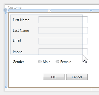
Application
This simple Windows Forms dialog took about 90 seconds to layout. The Windows Forms designer provided excellent layout adorners to assist in aligning the controls. The Properties Window was utilized to set control anchoring and enter the Label and Button text.
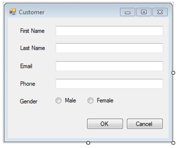
This simple WPF dialog took about 90 seconds to layout. The designer provided excellent layout adorners to assist in aligning and set anchoring on the controls. The Properties Window was utilized to enter the Label and Button text.
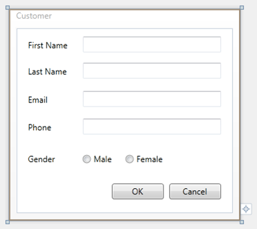
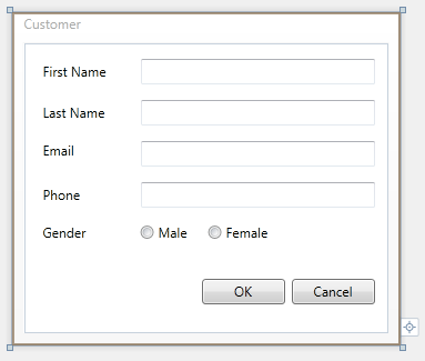
Let's Build This Dialog in WPF
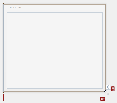
- Add a new WPF Window to the project and name it Customer.xaml
- Click the design surface outside the boundary of the Window to select the Window object
- Using the lower left resize adorner, resize the Window to 350 x 300. Notice the resize adorner labels indicate the size as you resize the Window.
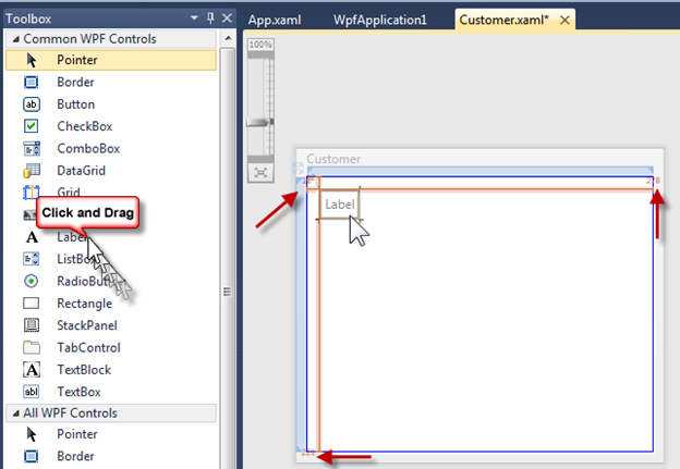
- Drag and drop a Label control from the ToolBox to the design surface inside the Window
- Notice the blue box adorner that gets displayed along with the inner area changing color to white when you drag the Label from the ToolBox. This is the Drop Target feature of the WPF and Silverlight Designer, providing you feedback where the object you are dragging can be dropped.
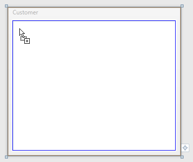
- After dropping the Label, move it to the upper left corner. Notice edge snap line adorners providing assistance as you get near the top and left edges.
- The number in the top left corner indicates the distance to each edge. The top right and bottom left adorners indicate how far the control is from those edges.
- With the new Label selected on the design surface, use the Properties Window to set the Label text to, First Name. In WPF and Silverlight this is accomplished by changing the Content property.
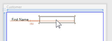
- Add a TextBox to the form
- To easily position the TextBox to line up with the Label, the text baseline adorner displays helping you line up the controls
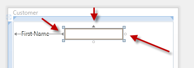
- After moving the TextBox, the selected adorners will now display as pictured below
- The small square adorners at each corner are used to resize the TextBox
- The below TextBox is anchored left and top. This is indicated by the left and top triangles the red arrows point to. Since the left edge of the TextBox is great than a few pixels from the edge, the anchoring adorner line is displayed.
- To now anchor this TextBox to the right also, we just need to click the right circle the right red arrow points to
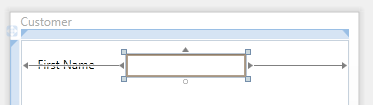
- After clicking the right circle, the right edge anchoring adorner is displayed
- Windows Forms terminology
- TextBox is anchored left, top and right
- WPF and Silverlight terminology
- TextBox has HorizontalAlignment set to Stretch and VerticalAlignment set to Top
- Now resize the TextBox. When resizing, notice the right edge snap line that appears down the length of the right edge. This indicates that the control is 12px from the edge.
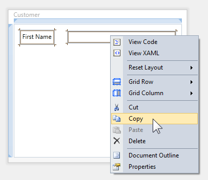
- Marquee select the Label and TextBox control
- Release the mouse and right click the selected TextBox, select Copy
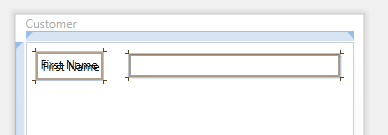
- Click the inner area of the Window, right click and select Paste
- The newly pasted controls will appear on top of the existing controls
- Notice the newly pasted controls are selected
- Click and drag the TextBox down; the Label will move with the TextBox
- As you are dragging down, notice that the designer snaps at two increments, 6px and 14px. For this application, we are using 14px.
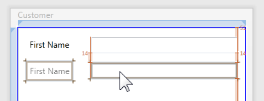
- Repeat the select, copy, paste and align action two more times
- Change the Label Content property as indicated below
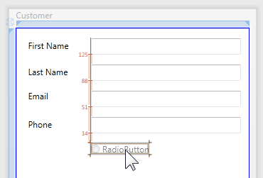
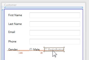
- Drag and drop a RadioButton below the bottom TextBox
- Move it into the position shown below
- Notice the left control edge snap line and the control distance adorner value of 14
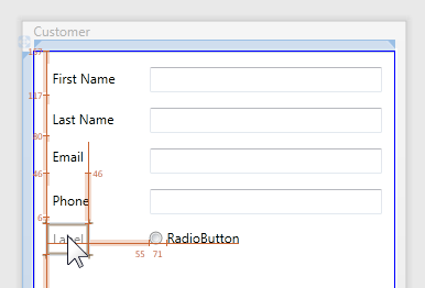
- Drag and drop a new Label control below the Phone Label. Move it below the Phone Label as pictured below.
- Notice the left edge snap line provides an easy guide for the left edge
- As you drag the new Label control down use the text baseline snap line of the RadioButton to align the control
- Change the new Label to read Gender and set the Content property on the RadioButton to Male
- Drag and drop a new RadioButton control to the design surface and move it into place as pictured below
- Change the text of the new RadioButton to Female
- Add a new Button to the design surface and move it into position as shown below
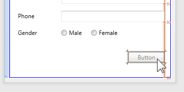
- After releasing the mouse the selection adorners will appear as pictured below
- Now anchor this button right and bottom:
- Click the left adorner, this will toggle anchor left to anchor right
- Click the top adorner, this will toggle anchor top to anchor bottom
- In WPF and Silverlight terminology the Button now has HorizontalAlignment set to Right, VerticalAlignment set to Bottom
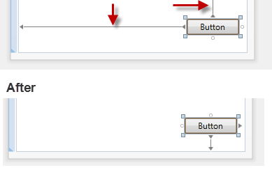
- Copy and paste the Button, then move into the position below.
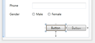
- Change the Button's text as pictured below by using the Properties Window to change the Content property of each Button.
- You can test the layout by resizing the Window control. Notice that the Buttons stay anchored to the bottom right and the TextBoxes resize with the Window.
Now that we see creating a form in WPF or Silverlight is very similar to the Windows Forms experience, let's look at how WPF or Silverlight easily enables making the above form a two column form. The two column form we will create will resize when the Window is resized.
Before proceeding, think about the steps you would follow using the Windows Forms platform to accomplish the task.
Under the Covers
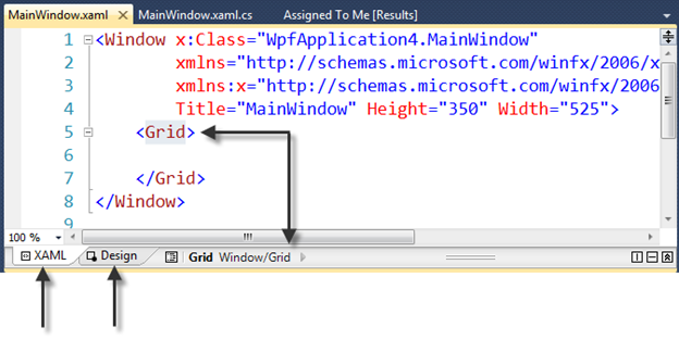
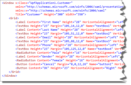
The Windows Forms Designer persists changes to a hidden code-behind file. The WPF and Silverlight Designer persists changes to XAML. To view the created XAML you can click on the XAML View Button. The XAML View and Design View buttons are located at the bottom of the Visual Studio tab you have been working with.
If your XAML is not currently visible, click the XAML View button.

Your XAML should look similar to the below image.
What I want to point out is the second element in the XAML, the Grid.
The entire time we have been adding controls to the form, we have actually been adding them as a child of the Grid control. The Grid is one of the available layout panels.
When the Grid has no rows or columns defined, it's effectively a single cell grid, positioning its child controls using Margin, HorizontalAlignment and VerticalAlignment properties. In similar fashion, Windows Forms uses Location and Anchor properties.
I've show the Grid control here because in the next step we will being working with it.
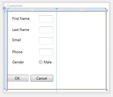
In WPF or Silverlight the simple steps to create a two column form are:
- Click on the Design View button to bring the designer back into view
- Right click on the Grid (the area inside the Window, not occupied by a child control), select Grid Column, Insert After
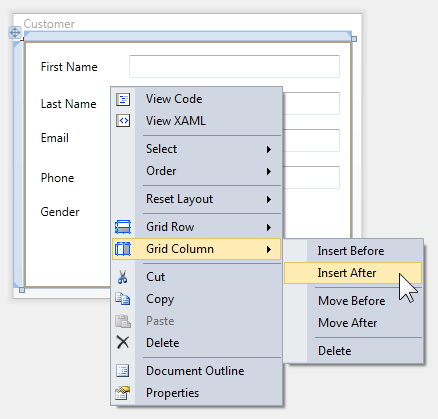
- The form should now look like the below image
- The Grid Column, Insert After function adds a new column after the current column and sets its width to 126px. Notice the 126 in the right column rail adorner.
- The left column size is displayed also; 1*. Star sizing is proportional sizing and is fully explained in this article WPF & Silverlight Layout Controls.
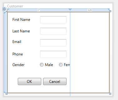
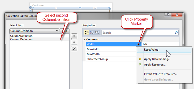
- With the Grid selected, locate the ColumnDefinitions property in the Properties Window, and click the Collection Editor elipsis button as indicated below
- When the Collection Editor opens:
- Select the second ColumnDefinition in the ListBox on the left
- Click the Width property Property Marker
- From the Context Menu, select Reset Value
- This will change the second column to its default value which is 1*
- Click the OK button to commit the changes
- This will effectively split the form into two proportionally spaced columns that are of equal width
- The form now has two equal sized Star sized columns.
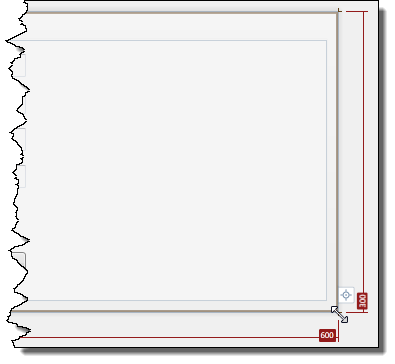
- Click the design surface outside the Window to select the Window. Notice the Grid's rail adorners are no longer visible and the Window resize adorners are now visible.
- Resize the Window to 600 x 300 as pictured below.
- Marquee select the first four Labels and TextBoxes and release the mouse button
- Right click the selected controls and select Copy from the Context Menu
- Right click the selected controls and select Paste from the Content Menu
- The eight controls will remain selected; now drag them into position to the right colomn
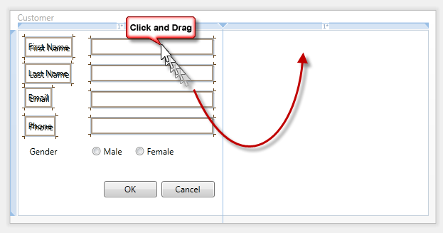
- Use the text baseline snap line to vertically align the controls as pictured below
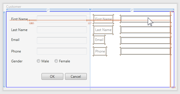
- Change the Content property on the Label controls on the right to the values below
- Marquee select the two Buttons, drag and drop them to the below location
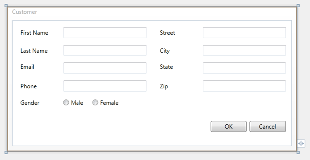
- Select the Window by clicking the design surface outside the Window boundary. Using the lower left corner resize adorner, resize the Window smaller and larger. Notice that the two columns stay the same size and the controls size to the column.
Content Based Layout
The purpose of the article is to help Windows Forms developer's make the transition to WPF or Silverlight. In the above walk-through we guided you through creating a WPF or Silverlight form using familiar form design techniques you used in Windows Forms.
Now that you have an understanding of control placement and some Grid concepts, let's walk-through building a content based layout form. This type of form is still very easy to build, it leverages more features of the Grid control and providing a layout that conforms to content as the size of that content changes at design or run-time; for example a globalized application when a different language is being used.
Again, in this next section we'll demonstrate how to easily create a form that uses content base layout instead of absolute positioning while at the same time leveraging layout techniques that are familiar to you.
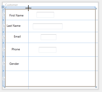
The strategy of this technique is to quickly layout, name and set the text values for your controls. When dragging a control from the ToolBox we are only concerned with positioning the control near where you want it. From the below image you can see I've paid very little attention to size or positioning.
Step One – Quick Layout
- Increase the size of the Window; this will give you more room to drag and drop controls with less precision
- Drag and drop controls onto the design surface then set their Content property for Labels
- Remember, you don't need to worry about exact positioning or sizing, now. Just lay the controls out very quickly
- We will add the two RadioButtons and two Buttons later on
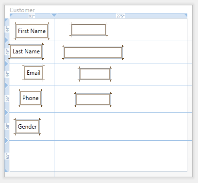
Step Two – Create Rows
- Select the root Grid control by clicking inside its boundary
- Create your first Grid row by clicking the left Grid Rail Adorner as pictured below
- Repeat creating the Grid rows so that your form looks like the below image
Step Three – Create Columns
- Create the columns by clicking the top Grid Rail Adorner as pictured below
Step Four – Auto Size Controls
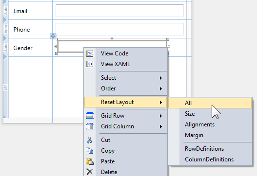
- With the root Grid selected, press CTRL+A to select all child controls of the Grid. Optionally, you can also marquee select controls.
- Right click on one of the selected controls, from the Context Menu select, Reset Layout, All
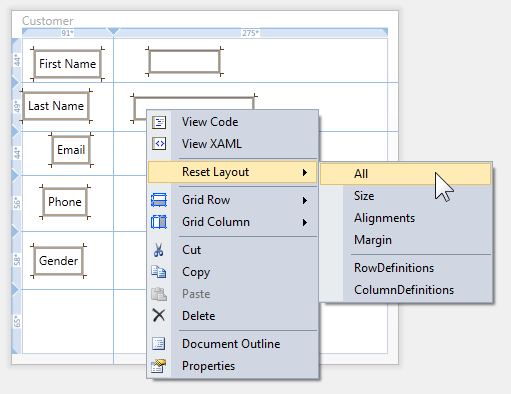
- Your form should look similar to the below image
- What has happened to each control is:
- Margin reset to default value, 0
- VerticalAlignment reset to default, Stretch
- HorizontalAlignment reset to default, Stretch
- Size reset to default, Auto
- Notice how each control consumes the full space allocated to it by its container cell.
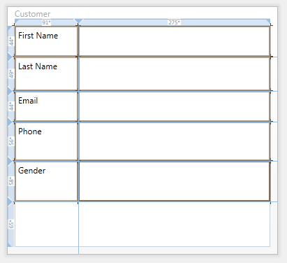
Step Five – Auto Size Rows
- Hover the mouse over the left Grid Rail Adorner near the numbers, a Grid Row size selector will appear
- Click Auto
- Repeat for each row except the last row
Step Six – Auto Size the First Column
Hover the mouse over the top Grid Rail Adorner near the numbers, a Grid Column size selector will appear
Click Auto
By auto sizing the first column we are allowing the text of the Label controls to grow at run-time or design-time based on a font, font size or language change.
- Another option is to provide a fixed width of reasonable value, replace the Label controls with TextBlocks and enable text wrapping. Since the rows are auto sized, if the text does wrap the row size will automatically be increased to accommodate the increase is height.
Step Seven – Margins
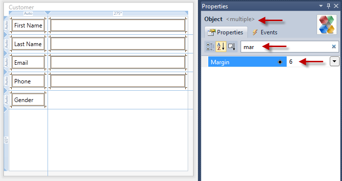
- Select all child Grid controls using CTRL+A
- Notice the Properties Window
- Top red arrow – multiple objects are now selected
- Middle red arrow – enter "mar" in the Search Box
- Bottom red arrow – enter "6" for the Margin
- On the design surface, all of the controls all have a Margin of 6.
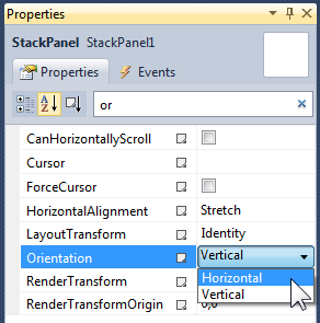
- Click the StackPanel icon in the ToolBox, and then draw the StackPanel in the column next to the Gender Label.
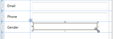
- Use the Reset Layout feature for the StackPanel
- Using the Properties Window, set the following properties:
- Orientation to Horizontal
- Margin to 6
With the StackPanel selected double click on the RadioButton icon in the ToolBox to create the first RadioButton
Repeat the double click action to create the second RadioButton.
Using the Properties Window set the following RadioButton properties :
- Content property for each RadioButton to the appropriate text (Male, Female)
- Reset Height property as pictured below
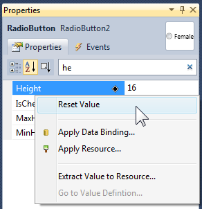
- VerticalAlignment to Center
- Female RadioButton, set the Margin property to 12,0,0,0
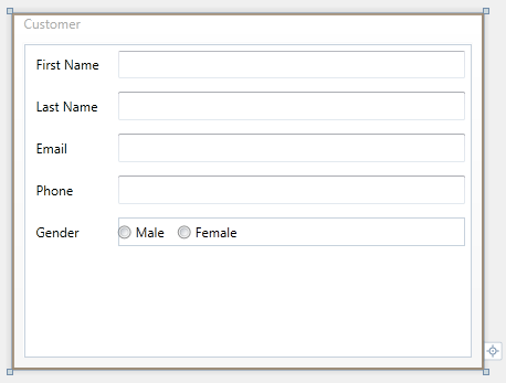
Your form should now look like the below image
We will now use the Grid SharedSizeScope feature you learned about in the WPF & Silverlight Layout Controls article.
This feature enables us to ensure that the Button controls will be the same size, even if the text of one button is shorter/longer than the other Button.
- Draw a new Grid in the row below the RadioButtons
- Add a column to that Grid near the middle of the Grid
- Add a Button control to each Grid cell as in the below picture
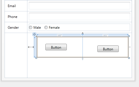
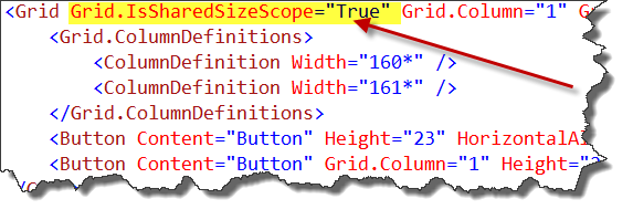
- With the new Grid selected on the design surface, switch to XAML view. Notice that the same Grid is selected in the XAML Editor for you.
- Add the attached property, Grid.IsSharedSizedScope and set its value to True.
- This attached property is currently not available in the Properties Window so we need to use the XAML Editor.
- Switch back to Design view and select the new Grid again.
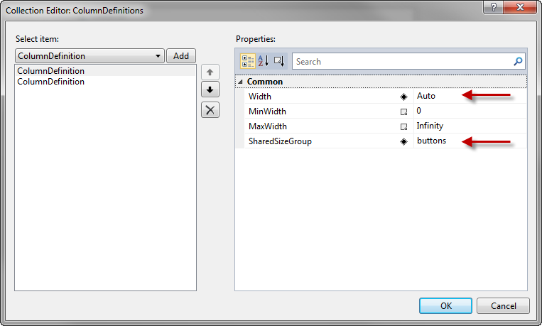
- Using the Properties Window, locate the ColumnDefinitions property and click the ellipsis button to open the Collection Editor.
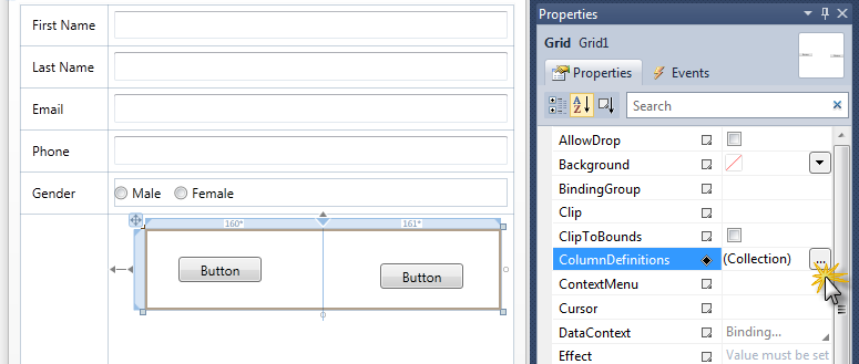
- For both columns, set the Width to Auto and the SharedSizeGroup to buttons
- Click OK to close the dialog and commit the changes
- On the design surface, select both Button controls in the new Grid
- Using the Properties Window, set the six properties indicated by the red arrows
- Setting the Button Padding property provides nice internal spacing between the Button's text and border.
- Your form will now look like the below image
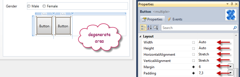
Information |
What is the above degenerate area? The degenerate area (or degenerate zone) is an area of the Grid that remains after the last column or row. The above Grid is 300px wide, but its two columns are Auto sized only taking up about 110px total; the remaining 190px area is the degenerate area. Notice the top Grid Rail Adorner for the degenerate area does not have a number on it. This is because there really is no column there. The missing number on a Grid Rail Adorner for a row or column is a visual indicator that that row or column does not exists. |
- On the design surface, select the new Grid
- Using the Properties Window, set the five properties indicated by the red arrows
- Your form will now look like the below image
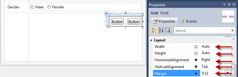
Information |
The reason we right aligned the above Grid is to anchor the Grid (and the child buttons) to the right edge of the form. If the form is resized, the Grid will stay anchored to the right edge. |
- Using the Properties Window, selected each Button and set the Content property adoringly
- Notice the buttons have the same width. This provides a nice clean look.
- Resize form to desired size.
Tip |
This is an auto sized form. Notice when you resize the forms width, the TextBoxes resize with the form. At your option, you could set a fixed width for the TextBoxes. At your option you could also set the MinWidth property on the Window or TextBoxes to prevent the user from resizing the dialog too small. |
Review
In this short article we have learned that:
- Form layout skills learned in Windows Forms transfer to WPF and Silverlight
- Absolute positioning can be used in WPF or Silverlight applications
- Adopting content based layout in WPF or Silverlight can easily be achieved by following a simple workflow:
- Roughly layout the form
- Add Grid rows and columns
- Resize Grid child controls
- Set appropriate Margins for child controls
- Add additional controls, etc.
Microsoft values your opinion about our products and documentation. In addition to your general feedback it is very helpful to understand:
- How the above features enable your workflow
- What is missing from the above features that would be helpful to you
Thank you for your feedback and have a great day,
Karl Shifflett
Expression Team
Learning the WPF & Silverlight Designer
 | The WPF and Silverlight Designer in Visual Studio 2010 provides a convenient and familiar set of tools, that allow developers to get a jump-start on building the next generation of high quality data-centric business applications. The tools grow with you as your applications exploit the full power of the WPF and Silverlight platforms, by providing comprehensive guided access to data binding capabilities, and convenient tools for finding and applying styles and resources to change the look of your application. Check out the content below for a comprehensive guided tour of the new tools, and see how easily you will be able to deliver a top quality user interface in your next application. |
Loading Metadata for Microsoft Controls
I have received several requests for information on loading metadata for WPF & Silverlight controls shipped by Microsoft. For example, a developer wanted to add a design time context menu to a Button control but couldn't figure out how to add the required metadata.
I covered the locating and loading of metadata for custom controls that you authored in this post.
In this post I'll cover how to locate and load metadata for controls that you were not the author for.
Table of Contents
- Locating Metadata
- Beta2 Registry Entries
- Post Beta2 Registry Entries
- Loading Metadata
- Comments
In my previous post I explained that metadata is loaded from assemblies and those assemblies had a specific naming convention and location relative to the control assembly it was providing a design-time for.
In this post we'll learn how to use a registry entry to provide the location of the assembly that has metadata you want Visual Studio to load.
You will need a separate registry entry for your WPF & Silverlight design assemblies.
To add a twist, the registry entry used in Beta2 will be different for all post Beta2 builds. I'm telling you that now so that you can be prepared and have the code ready for the next release of Visual Studio 2010.
FYI: The XAML Power Toys for Visual Studio 2010 Beta2 Cider Designer design-time I did uses these registry entries to provide design-time metadata for the WPF & Silverlight Grid control.
Beta2 Registry Entries


The full path of the registry key is below: (line breaks for readability only)
HKEY_CURRENT_USER\Software\Microsoft\VisualStudio\10.0\DesignerProfiles\
Microsoft.Windows.Design.Metadata.DeveloperMetadata\
XAMLPowerToys.VisualStudio.Design, Version=1.0.0.0, Culture=neutral, PublicKeyToken=null
Note: For 64 bit operating systems, you must use below modified registry key path:
HKEY_CURRENT_USER\SOFTWARE\Wow6432Node\Microsoft\VisualStudio
The last line is the assembly full name and serves as the unique subkey name under Microsoft.Windows.Design.Metadata.DeveloperMetadata.
The key has three values, Assembly, Class and CodeBase.
Assembly: Provide the full assembly name
Class: Provide the class name that implements IProvideAttributeTable
CodeBase: Provide the full path to the assembly
The above information provides Visual Studio the required information and it will load the metadata.
Post Beta2 Registry Entries
Beginning with all versions of Visual Studio 2010 after Beta2, the registry keys have changed and the following will be used instead of the above.


The full path of the registry key is below: (line breaks for readability only)
HKEY_LOCAL_MACHINE\SOFTWARE\Microsoft\VisualStudio\10.0\DesignerPlatforms\
.NetFramework\Metadata\XamlDesigner\
XAMLPowerToys.VisualStudio.Design, Version=1.0.0.0, Culture=neutral, PublicKeyToken=null
Note: For 64 bit operating systems, you must use below modified registry key path:
HKEY_LOCAL_MACHINE\SOFTWARE\Wow6432Node\Microsoft\VisualStudio
The last line is the assembly full name and serves as the unique subkey name under XamlDesigner.
The key has three values, Assembly, Class and CodeBase.
Assembly: Provide the full assembly name
Class: Provide the class name that implements IProvideAttributeTable
CodeBase: Provide the full path to the assembly
The above information provides Visual Studio the required information and it will load the metadata.
Once the metadata is located, Visual Studio will then load the metadata.
When Visual Studio locates an assembly that implements IProvideAttributeTable, Visual Studio can load metadata for any type. This is how the XAML Power Toys for Cider is able to load design-time metadata for the Microsoft Grid control.
Microsoft values your opinion about our products and documentation. In addition to your general feedback it is very helpful to understand:
- How the above feature enables your workflow
- What is missing from the above feature that would be helpful to you
Thank you for your feedback and have a great day,
Karl Shifflett
Visual Studio Cider Team
Loading Projects in Visual Studio not Located on Local Machine
The new boot from vhd feature that shipped in Windows 7 and Server 2008 has now given developers new options for setting up a test systems with different versions of Visual Studio.
For the purpose of this post, local system is the vhd boot volume and host system is the operating system and its drives that the vhd is physically located on.
Some developers are booting into their vhd, then accessing source projects that are actually located on the host system or are trying to load projects located on the network.
We recommend that projects be located on the local system. However, if your scenario requires that you load projects not located on the local system, the following steps can be taken to enable this scenario.
Network Share
If you must use a project on a network share, map the network share to a local drive rather than trying to use UNC path similar to the below example.
Example: Map \\systemName\pathName to e:\shareName.
loadFromRemoteSources
The loadFromRemoteSources option is available to enable assemblies being loaded from remote sources to be loaded as full trust.
Please ensure that you read the MSDN loadFromRemoteSources topic and are fully aware of the implications of using this setting. The MSDN topic has instructions for enabling this setting.
If you have Visual Studio 2010 installed on a vhd, and your source projects are located on the host system or network drive, you'll need to use the loadFromRemoteSources setting to enable this scenario.
Microsoft values your opinion about our products and documentation. In addition to your general feedback it is very helpful to understand:
- How the above features enable your workflow
- What is missing from the above feature that would be helpful to you
Thank you for your feedback and have a great day,
Karl Shifflett
Visual Studio Cider Team
New Visual Studio Magazine Article on Building Data Bound WPF and Silverlight Applications
Check out this new Visual Studio Magazine article which walks through some ways of using the Visual Studio 2010 designer to create data bound applications.
https://visualstudiomagazine.com/articles/2010/05/01/building-data-bound-wpf-and-silverlight-applications.aspx
Send us your feedback on this article, or any other WPF & Silverlight Designer topic, over on the MSDN Forums:
https://social.msdn.microsoft.com/Forums/en-US/vswpfdesigner
Thanks!
The WPF and Silverlight Designer Team
Setting Up Visual Studio for WPF and Silverlight Development
This article has a corresponding video that can be viewed here.
This important information will enable you to be successful in discovering the toolset and setting up Visual Studio 2010 for WPF and Silverlight development.
Table of Contents
- Visual Studio Tool Window Layout
- Design View
- Split View Bar
- XAML Editor
- Tag Navigator
- Properties Window
- XAML Text Editor Options
- Video
- Comments
In order to customize the layout of Visual Studio we will open a new project. Opening a new project makes all tool windows available.
Start Visual Studio 2010.
From the File menu hover over New, then select New Project…

Figure 1 New Project Menu Selection
New Project Dialog will be displayed.

Figure 2 New Project Dialog
| Note |
| The Target Framework Version ComboBox value defaults to the last selection made. When creating a new project, verify the desired Target Framework Version is selected. |
- Step 1 – Select language; Visual Basic or C# then select Windows.
- Step 2 – Select WPF Application.
- Step 3 – Enter project name.
| Tip |
| While it is permissible to have spaces in the project name this practice discouraged. |
- Step 4 – Click OK to create your new WPF Application.
Suggested Visual Studio Layout
Visual Studio provides a feature rich and powerful development environment for developers to create a wide range of application types. Figure 3 below pictures a suggested layout for WPF and Silverlight application development.

Figure 3 Visual Studio Layout
- Text Editor Toolbar – gives quick access to commonly used features like indenting, commenting and bookmarks. To add the Text Editor Toolbar, right click on the on the Toolbar, then select Text Editor from the drop down menu.
- Left Tool Windows
DataSources Window – Allows dragging of database or objects onto the design view. Used to quickly create data bound forms. To add the DataSources window, click on the Data menu and select Show Data Sources.
Server Explorer – Allows setting up database connections and browsing available servers. Is displayed by default.
Toolbox – Allows dragging installed controls or solution controls onto the design view or XAML editor. Is displayed by default.
Document Outline – Allows navigating the structure of your application. Used to single or multi-select objects. Provides thumbnail preview ToolTip of an object as the mouse hovers over it. To add the Document Outline, click on the View menu, click on Other Windows and select Document Outline.
- Some developers like to have the Document Outline visible at all times, so they position the Document Outline tool window below the above three tool windows group as in Figure 4 below.

Figure 4 Alternate Document Outline Position
| Tip |
| For developers new to WPF or Silverlight, the Document Outline is an invaluable tool for understanding the sometimes deeply nested control tree. The Document Outline tree view makes it very easy to navigate and select objects in your application. |
- Bottom Tool Windows. These windows are not unique to the XAML editing environment.
- Error List – Displays build errors and XAML errors in design view or XAML editor. To add the Error List, click on the View menu and select Error List. The Error List is also displayed by default when an error is detected.
- Task List – Displays code Comments and User Tasks. To add the Task List, click on the View menu and select Task List.
- Output – Displays build output, debug messages and runtime diagnostic output. To add the Output tool window, click on the View menu and select Output. The Output tool window is also brought into view when compiling or debugging.
- Bookmarks – Displays bookmarks. Used to manage and navigate bookmarks. To add the Bookmarks tool window, click on the View menu and select Bookmarks.
| Tip |
| Bookmarks are available in XAML files as well as code files. This feature makes it very easy to switch between files. |
- Designer region – contains Design View, Split View Bar, XAML View, Tag Navigator and Code View. This region is where most of the developers time is spent designing layouts and writing application code. Each of these areas will be covered below.
- Top right Tool Windows
- Solution Explorer – used to open files for editing in various Visual Studio editors. Displays all solution projects and project items. Is displayed by default.
- Class View – used to view the types and referenced types in the solution. Is displayed by default.
- Properties Window – used to edit properties for the selected object. Object selection can be initiated from the Solution Explorer, Class View, Document Outline, Design View, XAML View or the Tag Navigator. Is displayed by default. The Properties Window will be covered below.
Design View
Design view provides true WYSIWYG (What You See Is What You Get) application design experience. Developers use this view to layout their applications.

Figure 5 Design View
Zoom Control
Design view provides a Zoom control in the upper left corner to allow the developer to zoom design view in and out. See Figure 5 above. At the bottom of the zoom control is a toggle button. This button toggles between, "Fit in view" and "100% zoom level."
The Pan tool is available when the design view is displaying horizontal and or vertical scrollbars. When the designer has focus and you press the SPACE BAR, the mouse cursor will change to the hand cursor indicating that you can pan the design surface. Click and drag the design surface to reposition it.
The Pan tool will only allow movement of the design surface if the scrollbar for the direction of movement is visible. When both horizontal and vertical scrollbars are visible the design surface can be repositioned in all directions.
The root size mode button toggles between a Fixed Size root and an Auto Sized root. The root is the outmost control. In Figure 5 the root control or container is a Window.
When set to Fixed Size, the root container will have the same height and width at design time and run time.
When set to Auto Size, the root container will have a fixed design time height and width and but will auto size itself at run time. See the Auto Size UserControl root in Figure 6 below.

Figure 6 Auto Sized Root
| Note |
| The root sizing becomes very important when designing UserControls. Typically UserControls consume the available space given to them by their hosting control and auto sizing is desirable. However, at design time if the UserControl was auto sized and had no content, it would shrink to size 0, 0. Auto Size root allows the UserControl to have a design time height and width and but also have auto size behavior at run time. |
After building a solution, when you select another tab that has a XAML file and the designer is visible, you'll see the below Information bar. Click the Information bar to reload design view.

Figure 7 Information Bar
| Note |
| The Information bar is only shown for XAML files that were not the active Visual Studio document when the solution was built. If the current document is the XAML file, that document will automatically be reloaded during the build process. |
After building the solution, attempting to use Design View when an error exists will cause the below Information bar to appear at the top of Design View. You need to correct the errors and this Information bar will disappear, making Design View usable again.

Figure 8 Information Bar
Split View Bar
The Split View Bar gives the developer powerful tools for controlling and sizing the design and XAML views.

Figure 9 Split View Bar
- Design is a tab header. When clicked it will bring the Design view into view. This feature is used when the Design and XAML views consume all of the space and one is hidden from view. Double clicking the Design tab will cause you to enter full Design view mode.
- The Switch Panes button will swap the positions of the Design and XAML views. This button is only visible when the Design and XAML views are both visible.
- XAML is a tab header. When clicked will bring the XAML view into view. This feature is used when the Design and XAML views consume all of the space and one is hidden from view. Double clicking the XAML tab will cause you to enter full XAML view mode. Full XAML view mode is described later.
- Dragging the resize bar up and down will resize the Design and XAML views.
- Split Buttons
- The left button is the Vertical Split button. When clicked will split the Design and XAML views vertically instead of the default, horizontally.
- The middle button is the Horizontal Split button. When clicked will split the Design and XAML views horizontally. This is the default.
- The right button is the Collapse Pane, Expand Pane toggle button.
- If the designer region is displaying both Design and XAML views, when clicked will cause the top pane to consume all the space of the designer region.
- If the designer region is consumed by either the Design or XAML view, when click will return the designer region back to split view.
XAML View
XAML view provides a complete editing experience for XAML documents, that includes IntelliSense, auto-formatting, syntax highlighting, and tag navigation. When you edit XAML, Design view updates to reflect your changes.
To easily navigate through your XAML document, you can either select elements on the design surface or use Document Outline to change your selection.
Visual Studio 2010 supports Markup Extension IntelliSense. IntelliSense options will appear as a dropdown list after typing a "{" to begin an element. Navigate IntelliSense with the arrow keys and press tab to select a value.
XAML errors are marked in the XAML editor with a blue squiggle underline, which can be hovered over to produce a tooltip with error information. Those same errors are also listed in the Error List as in Figure 10 below.

Figure 10 XAML Editor Error
| Note |
| Notice the yellow bar to the left of the <Button tag in Figure 10 above. This indicates this line of XAML has changed since the last time the file was saved. If the bar was green, this would indicate this line of XAML was changed and saved since the file was opened. |
Full XAML View Limitations
If you open a XAML file in full XAML view the Properties Window for selected objects will not be available. The Properties Window depends on Design View being loaded. If you switch to Design View and click the displayed link to reload the designer, you can then switch back to full XAML view and the Properties Window will display the selected object.

Tag Navigator
The Tag Navigator allows easy navigation of the current leaf of the XAML document.

Figure 11 Tag Navigator
- Document Outline button. Click this to bring the Document Outline into view.
- Currently selected control type and control name.
- Click on any of the parent controls of the currently selected control to select that control.
- Click this right arrow button to select any children of the currently selected control.
Properties Window
The Properties Window provides rich property editing for the selected object's properties.

Figure 12 Properties Window
Thumbnail Preview displays a thumbnail image of the selected control.
Control Type is the full type name of the selected control.
Control Name is the name of the selected control.
Property Search Textbox provides quick access to properties. The search algorithm finds all properties that contain the characters entered in the Search Textbox.
Categorized button changes the property listing to group properties by categories.
Properties button changes the list to list properties instead of events.
Alphabetical button changes the property listing to list properties alphabetically.
Events button changes the list to list events instead of properties.
Property Markers indicate where the value is coming from. In Figure 12 above you see 5 different Property Marker icons.
- Clicking or right clicking on the Property Marker brings up the Property Marker content menu as in Figure 13 below.

Figure 13 Property Marker Content Menu
Reset Value will reset the property value back to its default value.
Apply Data Binding will open the Data Binding Builder and enables a data binding expression to be assigned to this property. This will be covered in a future article.
Apply Resource will open the Resource picker and allow a resource to be assigned to this property. This will be covered in a future article.
Extract value to resource will open the Create resource dialog enabling the current property value to be assigned to a new resource and that new resource assigned to the property value. This will be covered in a future article.
XAML Text Editor Options
There are a number of configurable XAML text editor options that can be set using the Visual Studio Options dialog. To open the Options dialog, click the Tools menu and select Options. When the Options dialog is displayed find Text Editor in the left TreeView and expand it. Then expand XAML and finally expand Formatting and click on Spacing.

Figure 14 XAML Editor Options
- The Attribute Spacing section in Figure 14 determines how XAML element attributes are formatted when XAML is pasted in the document or when the document is formatted with the Format Document command (CTRL+K, CTRL+D.) You can also run the Format Document command from the menu by clicking on the Edit menu, clicking on Advanced and selecting Format Document.
If "Preserve newlines and spaces between attributes" is selected, document format will not be changed.
If "Insert a single space between attributes" is selected, element attributes will be collapsed to a single line with a single space between attributes.

Figure 15 Attribute Single Space Formatting
If "Position each attribute on a separate line" is selected, element attributes will be expanded and each attribute will be on a separate line.
- Position of the first attribute is controlled by the "Position first attribute on same line as start tag" Checkbox.

Figure 16 Attribute Multi-Line Formatting
- The Element Spacing section in Figure 14 determines how XAML elements are formatted when the XAML is pasted in the document or when the document is formatted with the Format Document command.
- If "Preserve new lines in content" is selected, document format will not be changed.
- If "Collapse multiple empty lines in content to a single line" is selected, multiple empty lines will be collapsed to a single line.
- If "Remove empty lines in content" is selected, all empty lines in the document will be removed.
Take a few minutes to change the above settings with the simple XAML document you have loaded. After making a settings change, use the Format Document command and reformat the XAML to view how the command changes your XAML document formatting.
Reopen the Options dialog and navigate to the XAML, Miscellaneous tab.

Figure 17 XAML Editor Options
If "Closing tags" is selected, when editing XAML and you enter the close tag for the element, a matching end element tag will automatically be inserted. In Figure 18 below, <Button> was typed, </Button> was automatically inserted by Visual Studio.

Figure 18 Close Tag
If "Attribute quotes" is selected, when editing XAML and you enter a property name, both the closing and ending double quote will automatically be inserted after the equals sign for you.
If "Closing braces for MarkupExtensions" is selected, when editing a property value in XAML and you type "{" a corresponding "}" will be inserted for you.
If "Commas to separate MarkupExtension parameters" is selected, when editing a MarkupExtension in XAML, pressing the SPACE BAR will automatically insert a comma for you. After typing FirstName, pressing the SPACE BAR causes a comma to be inserted, and the insertion point moved one space to the right of the comma.

Figure 19 MarkupExtension Comma Insertion
If "Always open documents in full XAML view" is selected, when a XAML document is opened, XAML view will consume the designer region. When using this feature keep in mind the limitations discussed in the above section, "Full XAML View Limitations."
By default, in Visual Studio 2010, each time you build a WPF and Silverlight project, any types that derive from FrameworkElement or higher will be automatically added to the Toolbox. The types that are added are grouped into Toolbox tab by assembly. The purpose of this feature is to make it easy for developers to consume the UserControls and CustomControls they create on a form.
To you enable/disable this feature by checking or un-checking the CheckBox Automatically populate toolbox items in Figure 17 above. The red arrow points to this CheckBox.
Microsoft values your opinion about our products and documentation. In addition to your general feedback it is very helpful to understand:
- How the above feature enables your workflow
- What is missing from the above feature that would be helpful to you
Thank you for your feedback and have a great day,
Karl Shifflett
Visual Studio Cider Team
Silverlight 4 Releases, Silverlight 4 Tools for Visual Studio 2010 RTM available now!
As part of today's release of Silverlight 4, the WPF and Silverlight Designer team is pleased to announce that a release of the Silverlight Tools which works with Visual Studio 2010 RTM is now available.
Where Can I Get These Tools?
If you already have Visual Studio 2010 RTM installed, you can get everything you need to get started with Silverlight 4 development by following the instructions at https://www.silverlight.net/getstarted/
This Tools Release is Labelled RC2, Why Not RTM?
This is the RC2 release of the Silverlight 4 Tools for Visual Studio 2010. This means the tools will have further update before the tools themselves are considered RTM.
However, it works right now with Visual Studio 2010 RTM and Silverlight 4 RTM so you can start building applications right away.
Where Can I Go To Give Feedback?
We look forward to hearing your feedback on this latest release - head over to https://social.msdn.microsoft.com/Forums/en-US/vswpfdesigner/threads
Thank you!
WPF & Silverlight Designer Team
Silverlight Support for Visual Studio 2010 Release Candidate
Silverlight 3 projects are supported with the Visual Studio 2010 Release Candidate build – however Silverlight 4 projects are not yet supported.
We will be adding Visual Studio 2010 Release Candidate support for Silverlight 4 with the next public Silverlight 4 drop.
If you are doing active Silverlight 4 development today we recommend staying with the Visual Studio 2010 Beta 2 build for now.
Tim Heuer has also blogged about this limitation here.
Have a great day,
Karl Shifflett
Visual Studio Cider Team
Table of Contents
Taming the WPF Expander Control
The WPF Expander control has a header and a collapsible window that developers can use in several different ways. One technique is to place multiple Expander controls in a StackPanel to create a UI region of expanding sections, Another technique is to use the Expander as a way of hiding less important information on the UI, creating an on-demand region for the end user to view if needed. Outlook uses an Expander to provide the UI for its query builder. A while back, I wrote about a technique for having the Expander control popup overtop of other controls without moving them in this blog post.
This short post will help you to have a successful experience with the Expander control at design-time and run-time.
Known Issue Please Read
Unfortunately, a design-time bug was introduced in the 5/13/2010 release of Silverlight 4 Tools for Visual Studio download that negatively impacts the Expander control's design-time experience.
The Expander once expanded can't be collapsed on the design surface unless you close the form and reopen it. This bug will be corrected in a future release of Silverlight Tools or service pack.
Table of Contents
- Adding an Expander to the Design Surface
- Stacked Expanders
- Data Form Example

Adding an Expander to the Design Surface
When you drag and drop an Expander control from the Toolbox to the design surface the below XAML will be created for you.
<Expander Grid.Column="1" Grid.Row="2" Header="expander3" Height="100" HorizontalAlignment="Left" Margin="25,25,0,0" Name="expander3" VerticalAlignment="Top"> <Grid /> </Expander>
If you look at the above image, you'll notice some expanders have been named, "Has Layout Problem." The above default XAML actually causes the layout problem because the Expander control has been assigned Height property.
Below is an Expander with the Height set to auto (Height removed) and the inner child Grid Height set to 100. The inner child Grid will be displayed when the Expander is expanded. This Expander will not have any design-time issues.
<Expander Panel.ZIndex="99" Header="No Layout Problems" HorizontalAlignment="Left" Margin="17,7,0,0" Name="expander2" VerticalAlignment="Top" Width="225" Grid.Column="1" Grid.Row="2"> <Grid Background="Maroon" Height="100" /> </Expander>
Stacked Expanders
If you look at stacked Expanders in the above image you'll notice the bottom two Expanders are taking up much more vertical space than the top two Expanders even though all four Expanders are in a collapsed state. This is because the the bottom two expanders have their Height set on the Expander control and not the inner child Grid.
The below image pictures the desired Expander design-time experience. When the Expander is selected on the design surface, it expands, exposing the inner child Grid that can now be designed. Controls can be dragged to it from the Toolbox, etc.
However, if you want to drag another control from the design surface to the Expander, a slightly different technique is required. When you select any control not inside the Expander, the Expander will close. To drag another control into the Expander, select the other control, dragging the mouse over the header portion of the Expander and the Expander will automatically expand for you so you can drop your control as required.


The above image shows what happens when the two TextBoxes are selected on the design surface.
When the TextBox below the No Layout Problems Expander is clicked (first column), normal control selection takes place.
When the TextBox below the Has Layout Problem Expander is clicked (third column), the Expander expands and the Expander's child Grid is selected and not the TextBox. This occurs because the mouse is performing an action within the Expanders region. In reality the Expander is actually doing what it is supposed to do.
Since the lower Expander in column 3 and 4 has a height of 100, when any control is dragged or clicked within the Expanders size, the Expander expands. This is the same behavior we had above when the Expander had an Auto Sized Height, except the region that triggers the auto expansion was much smaller and did not interfere with other design-time gestures.
Solution
Setting the Expander control's Height to Auto will provide the best design-time experience. The height of the Expander will then be determined by the content of the Expander's Header.
The inner child Grid (or other Panel or control) can either be Auto Sized or have a fixed size. However, if the inner child Grid is Auto Sized and does not have any content, its design-time size will be very small until child controls are added.
You can download the above sample solution using the link at the bottom of this post.
Microsoft values your opinion about our products and documentation. In addition to your general feedback it is very helpful to understand:
- How the above features enable your workflow
- What is missing from the above feature that would be helpful to you
Thank you for your feedback and have a great day,
Karl Shifflett
Visual Studio Cider Team
TamingTheExpander.zip
Popular posts from this blog
[Excel] 문서에 오류가 있는지 확인하는 방법 Excel 문서를 편집하는 도중에 "셀 서식이 너무 많습니다." 메시지가 나오면서 서식을 더 이상 추가할 수 없거나, 문서의 크기가 예상보다 너무 클 때 , 특정 이름이 이미 있다는 메시지가 나오면서 '이름 충돌' 메시지가 계속 나올 때 가 있을 것입니다. 문서에 오류가 있는지 확인하는 방법에 대해서 설명합니다. ※ 문서를 수정하기 전에 수정 과정에서 데이터가 손실될 가능성이 있으므로 백업 본을 하나 만들어 놓습니다. 현상 및 원인 "셀 서식이 너무 많습니다." Excel의 Workbook은 97-2003 버전의 경우 약 4,000개 2007 버전의 경우 약 64,000개 의 서로 다른 셀 서식 조합을 가질 수 있습니다. 셀 서식 조합이라는 것은 글꼴 서식(예- 글꼴 종류, 크기, 기울임, 굵은 글꼴, 밑줄 등)이나 괘선(괘선의 위치, 색상 등), 무늬나 음영, 표시 형식, 맞춤, 셀 보호 등 을 포함합니다. Excel 2007에서는 1,024개의 전역 글꼴 종류를 사용할 수 있고 통합 문서당 512개까지 사용할 수 있습니다. 따라서 셀 서식 조합의 개수 제한을 초과한 경우에는 "셀 서식이 너무 많습니다." 메시지가 발생하는 것입니다. 그러나 대부분의 경우, 사용자가 직접 넣은 서식으로 개수 제한을 초과하는 경우는 드뭅니다. 셀 서식이 개수 제한을 넘도록 자동으로 서식을 추가해 주는 Laroux나 Pldt 같은 매크로 바이러스 에 감염이 되었거나, 매크로 바이러스에 감염이 되었던 문서의 시트를 [시트 이동/복사]하여 가져온 경우 시트의 서식, 스타일이 옮겨와 문제가 될 수 있습니다. "셀 서식이 너무 많습니다." 메시지가 발생하지 않도록 하기 위한 예방법 글꼴(종류, 크기, 색, 굵기, 기울임, 밑줄), 셀 채우기 색, 행 높이, 열 너비, 테두리(선 종류, ...
ASP.NET AJAX RC 1 is here! Download now
Moving on with WebParticles 1 Deploying to the _app_bin folder This post adds to Tony Rabun's post "WebParticles: Developing and Using Web User Controls WebParts in Microsoft Office SharePoint Server 2007" . In the original post, the web part DLLs are deployed in the GAC. During the development period, this could become a bit of a pain as you will be doing numerous compile, deploy then test cycles. Putting the DLLs in the _app_bin folder of the SharePoint web application makes things a bit easier. Make sure the web part class that load the user control has the GUID attribute and the constructor sets the export mode to all. Figure 1 - The web part class 2. Add the AllowPartiallyTrustedCallers Attribute to the AssemblyInfo.cs file of the web part project and all other DLL projects it is referencing. Figure 2 - Marking the assembly with AllowPartiallyTrustedCallers attribute 3. Copy all the DLLs from the bin folder of the web part...
Architecture Testing Guide Released
视频教程和截图:Windows8.1 Update 1 [原文发表地址] : Video Tutorial and Screenshots: Windows 8.1 Update 1 [原文发表时间] : 4/3/2014 我有一个私人的MSDN账户,所以我第一时间下载安装了Windows8.1 Update,在未来的几周内他将会慢慢的被公诸于世。 这会是最终的版本吗?它只是一项显著的改进而已。我在用X1碳触摸屏的笔记本电脑,虽然他有一个触摸屏,但我经常用的却是鼠标和键盘。在Store应用程序(全屏)和桌面程序之间来回切换让我感到很惬意,但总是会有一点瑕疵。你正在跨越两个世界。我想要生活在统一的世界,而这个Windows的更新以统一的度量方式将他们二者合并到一起,这就意味着当我使用我的电脑的时候会非常流畅。 我刚刚公开了一个全新的5分钟长YouTube视频,它可以带你参观一下一些新功能。 https://www.youtube.com/watch?feature=player_embedded&v=BcW8wu0Qnew#t=0 在你升级完成之后,你会立刻注意到Windows Store-一个全屏的应用程序,请注意它是固定在你的桌面的任务栏上。现在你也可以把任何的应用程序固定到你的任务栏上。 甚至更好,你可以右键关闭它们,就像以前一样: 像Xbox Music这种使用媒体控件的Windows Store应用程序也能获得类似于任务栏按钮内嵌媒体控件的任务栏功能增强。在这里,当我在桌面的时候,我可以控制Windows Store里面的音乐。当你按音量键的时候,通用音乐的控件也会弹出来。 现在开始界面上会有一个电源按钮和搜索键 如果你用鼠标右键单击一个固定的磁片形图标(或按Shift+F10),你将会看到熟悉的菜单,通过菜单你可以改变大小,固定到任务栏等等。 还添加了一些不错的功能和微妙变化,这对经常出差的我来说非常棒。我现在可以管理我已知的Wi-Fi网络了,这在Win7里面是被去掉了或是隐藏了,以至于我曾经写了一个实用的 管理无线网络程序 。好了,现在它又可用了。 你可以将鼠标移至Windows Store应用程序的顶部,一个小标题栏会出现。单击标题栏的左边,然后你就可以...


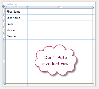


Comments
Post a Comment